Style Sheet Snacks: Getting started with Borders

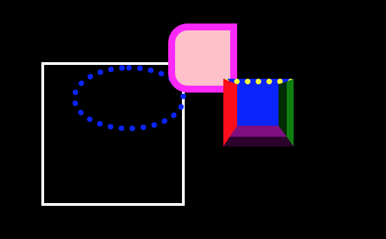
several examples of borders

Getting started with Borders

Welcome back to the 3rd installment of Style Sheet Snacks! The last few weeks, we got an introduction to gradients and learned how to create an easy scrolling element which fades. This week, we’ll talk again about an introduction topic: borders;

When it comes to web development, borders are an element which are used quite frequently. They can show the edge to an element, provide an underline between sections, or a number of other functions. In this section, we are going to give a beginners guide to using borders in CSS.

Basic Border

In its most basic form, a border is likely a solid line that surrounds an element. However, in CSS, the border style will actually take in 3 attributes: border thickness, border style, and border color.

For example, border: 1px solid black; will render something like:

See the Pen ZEzJoKJ by The Datababe (@Thedatababe) on CodePen.

Basic border optinos

In addition to making the border thickness and color customizable, the border pattern also has several other options:

  • dotted 
  • dashed
  • double
  • groove 
  • ridge 
  • inset 
  • outset 
  • none
  • hidden

See the Pen ZEzJoKJ by The Datababe (@Thedatababe) on CodePen.

Border Radius

Another staple of borders in CSS is the border radius. This becomes valuable when we want to make a shape that is anything besides a rectangle or a square. The border-radius will determine how curved an object is. A border-radius:50% will create a perfect circle.

See the Pen jONLxay by The Datababe (@Thedatababe) on CodePen.

Single Side Border or Border-Radius

The last part of this introduction to borders is creating a border on a single side. This is very much like the way borders work otherwise, but specifies the side. For example border-right:1px solid black would create a border on the right side of the element. Similarly, border-top-right-radius: 10px would create a rounded corner on the top right size of the element.

See the Pen yLBojKo by The Datababe (@Thedatababe) on CodePen.

Conclusion

That’s it for this week! We covered the basics of building borders in css, and gave examples of different styles, shapes, and side specifiers in our code. As always, leave your comments below! Happy Coding!
Style Sheet Snacks: Create a Fading Scrollable Element in pure CSS

Create a Fading Scrollable Element in pure CSS

Welcome to the 2nd installment if Style Sheet Snacks! This week, we’re going to show two ways of creating a scrollable element that fades out as the user scrolls. This could be used for any div with a scrolling overflow!

While there are more ways to achieve this using javascript, we are going to focus on pure css solutions.  

Method #1: Using Box Shadow

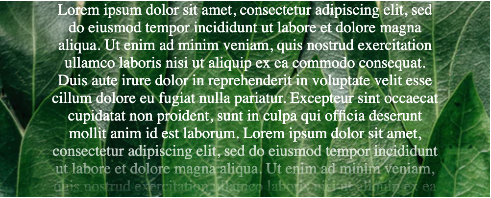
One method that certainly works for creating a “fading” effect on scrollable elements is to add an absolutely-positioned element with a box shadow in order to give the effect of the text fading out.

This method works wonderful with elements that have a background that is a single color, or no background.  It also has good support on older browsers which makes it a good choice if you can use it.   

In order to achieve the effect, you need to add an element with a box shadow attribute that is a linear gradient.  If you want to refresh on gradients, check out our last style sheet snack on the gradients here.  The gradient should range from 0 to 1 in opacity and use the color thats identical to the background of your element.

See the Pen Box Shadow Fade Effect by The Datababe (@Thedatababe) on CodePen.

Method #2: Using mask

While the above method works well across a number of browsers, it does not work well if you have a background image and you’d simply like text to become transparent towards the bottom of the element. For this reason, I much prefer using mask-image to create beautiful, scrolling divs that fade. However, it should be noted that this is not supported on older browsers,

This method is also a bit less code. Instead of using an absolutely positioned fade-out element, we can wrap our scrollable section in a container, and apply mask-image with a linear-gradient in order to fade out the text. Take a look at the codepen below to see how it works in action.

See the Pen Mask Fade Effect by The Datababe (@Thedatababe) on CodePen.

Conclusion

While both of these methods work on in certain situations, I always prefer webkit-mask because it is less code to write, and is an elegant solution that truly makes the text fade instead of covering the element with another in order to achieve the effect.

Style Sheet Snacks: Fun with Gradients

Fun with Gradients

Welcome to the first ever “Style Sheet Snacks” lesson! I am overjoyed to start this series as I hope to help give some tips on CSS3 as well as inspire you to try new ways to style your site, app, or components.

This first lesson is all about gradients, let’s talk about what a gradient is and how to create one with pure css.

What is a gradient?

A gradient in CSS is anything that had multiple effects and gradually changes from one to the other, or multiple. Elements usually have gradient color, opacity, or both. In this snack, we’re going to focus mostly on gradient backgrounds.

Linear Gradients

Linear Gradients are gradients that go in a single direction (horizontal or vertical). Let’s use a background gradient to style a square. We can use the attribute background: linear-gradient(red, yellow) in order to create a vertical gradient.

See the Pen Linear Background Gradient by The Datababe (@Thedatababe) on CodePen.

Similarly, we can go left to right using the keyword to right.

See the Pen BaBLwdN by The Datababe (@Thedatababe) on CodePen.

Radial Gradients

Radial gradients are just like they sounds. A gradient to goes out radially, or in a circle. In order to create a radial background, you can use a similar attribute to linear gradients except you can use the radial-gradient keyword.

background-image:radial-gradient(red, yellow)

See the Pen Radial Background Gradient by The Datababe (@Thedatababe) on CodePen.

Completely Customize the Gradient Direction

Gradients can be customizable even further by using multiple colors as well as angles and percentages of how far the color will go. For example, take a look at the Instagram logo. You’ll notice it has a gradient and has this very nice pink /purplish color , but it seems to be at an angle. Let’s recreate this in css!

See the Pen XWrjeeZ by The Datababe (@Thedatababe) on CodePen.

The above example is made by using a combination of radial and linear gradients (yes, you can use multiple in a single background!). Let’s take a look at the first gradient we used.

radial-gradient(circle farthest-corner at 35% 90%, #fec564, transparent 50%),

circle tells us the shape of the gradient (radial can be either circle or ellipse).
farthest corner tells us where the gradient ends. This is the default, so the gradient will be as wide as the element (100px).
at 35% 90% represents the x and y position of the center of the gradient, respectively.
#fec564 is the color of the inner most point on the gradient, which is a yellow color.
transparent 50% is the color at the outer most point on the gradient. This will be the same yellow color, but at 50% opacity.

This should give you a good idea for a starting point at how this gradient was created.

Gradient Box Shadows

Okay, so this one isn’t exactly a gradient per-say, but it can look like one! With a few different box shadows you can actually make it look like you have a multicolored gradient.

See the Pen MWgjEXO by The Datababe (@Thedatababe) on CodePen.

Bonus: Text Background Gradients

See the Pen gOYwGoO by The Datababe (@Thedatababe) on CodePen.

Using gradients/background images as text backgrounds is one of my all time favorite style tricks! We even use it with our Style Sheet Snacks logo. It’s actually quite easy to do with just a few lines of css. (*note: this doesn’t work in every browser, but most modern ones have support).

Other Resources

We’ve only just touched the surface on gradients. For more information, check out a few of these resources:
https://cssgradient.io/resources/
https://www.w3schools.com/css/css3_gradients.asp
http://angrytools.com/gradient/

As always, feel free to leave comments in the comment section below! Happy Coding!